
HTML Responsive Web Design
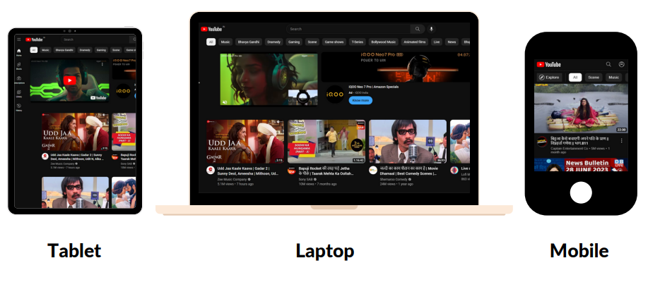
- Responsive design means creating web pages in such a way which looks good in all devices like desktop, laptop, tab, mobile.
- Web pages will automatically adjust on all the devices once you open a web page on different devices with different screen size.
- To achieve a responsive design, several techniques and features are commonly used.
Most important and first thing to remember is –
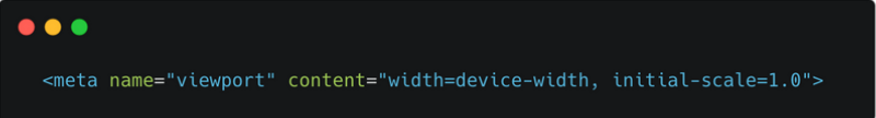
Viewport Meta Tag:
- Add the below line in meta tag to all your web pages.
To achieve responsive web design, several techniques and features are commonly used:
a) Fluid Grid Layout:
- Use width in percentage instead for a fixed value. That will adjust with all the screensize.
b) Flexible Images and Media:
- Images and media elements, such as videos or embedded content, should also be responsive. They can be styled using CSS to ensure they resize and adapt based on the available screen space.
c) Media Queries:
- By using media queries, you can create specific CSS styles for different screen sizes or devices.
Syntax:
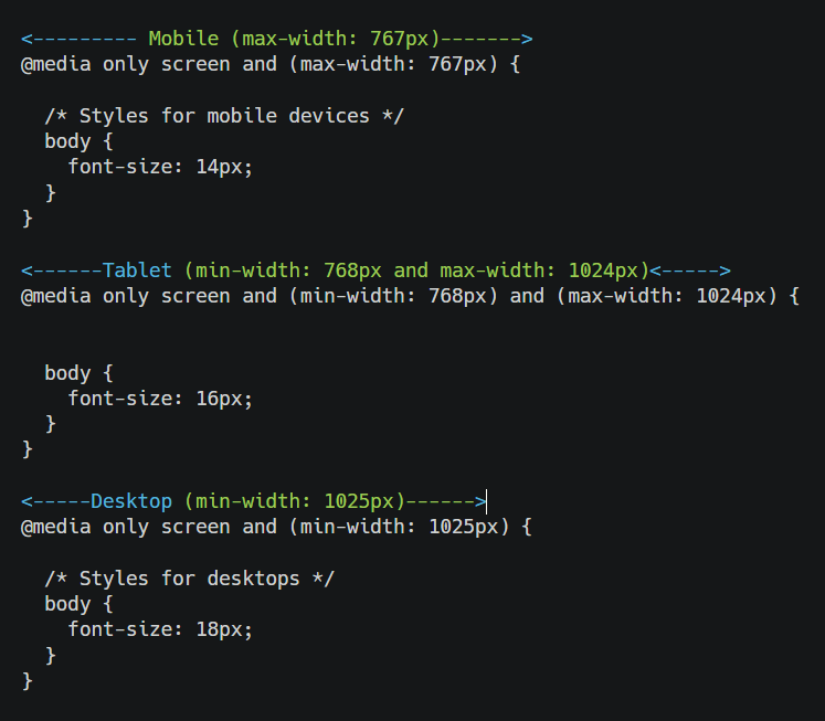
Explanation:
a) Mobiles :
- Applies styles when the screen width is 767px or smaller.
b) Tablet :
- Applies styles when the screen width is between 768px and 1024px.
c) Desktop :
- Applies styles when the screen width is 1025px or larger.
Important Note: Want to download the full HTML course as a PDF? Click here to save it locally!