

What is CSS Flex?
- CSS flexbox is a one-dimensional layout pattern that makes it easy to design flexible and effective layouts.
- Divide space between items and control their alignment in a given container flex
layout. - It also provides a lot of flexibility. With flexbox, we can organize items from left to
right, top to bottom, and at the same time control the spacing and order of the items
in the container. - In flexbox, there are mainly two entities: a parent container (the flex container) and
the immediate children elements (flex items).
Parent Container Properties:-
display
flex-direction
flex-wrap
flex-flow
justified-content
align-items
1. Flex display Property:-
First, we have the display property. This is what defines the flex container and it’s mandatory when working with Flexbox.syntax:-
<style>
.box {
display:flex;
}
</style>
<div class="box">
<div>1</div>
<div>2</div>
<div>3</div>
</div> 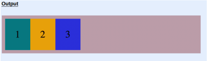
2. flex-direction
Next is flex-direction , which defines the direction in which the flex items are placed in the container.flex-direction can accept one of four values:-
a). row
b). row-reverse
c). column
d). column-reverse
a). flex-direction: row
The first value is a row that is the default value of flex-direction . It doesn’t make any changes by default. It’s placed on the main axis from left to the right.Syntax:-
<style>
.box {
display:flex;
flex-direction:row;
}
</style>
<div class="box">
<div>1</div>
<div>2</div>
<div>3</div>
</div>
b). flex-direction: row-reverse
This sets the main access direction from right to left, which results in the flex items being placed from right to left. In the example below, you can see that the items are now placed in the reverse order. Item 1 is placed to the right.Syntax:-
<style>
.box {
display:flex;
flex-direction:row-reverse;
}
</style>
<div class="box">
<div>1</div>
<div>2</div>
<div>3</div>
</div> 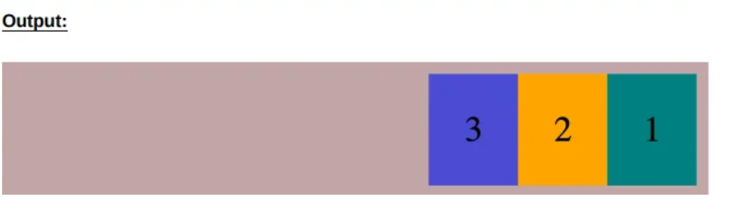
c). flex-direction: column
When you set flex-direction to column , the main axis goes from top to bottom, sothe items are now stacked on top of each other.Syntax:-
<style>
.box {
display:flex;
flex-direction:column;
}
</style>
<div class="box">
<div>1</div>
<div>2</div>
<div>3</div>
</div> 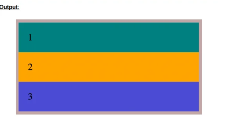
d). flex-direction: column-reverse
We also have column-reverse , which stacks the items in the reverse order. Look at the example below. You can see Item 1 is at the bottom and Item 3 is at the top.Syntax:-
<style>
.box {
display:flex;
flex-direction:column-reverse;
}
</style>
<div class="box">
<div>1</div>
<div>2</div>
<div>3</div>
</div> 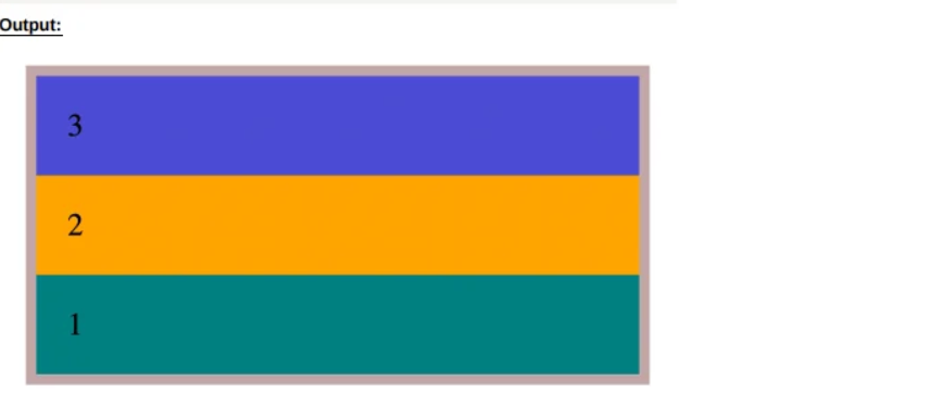
3. flex-wrap
flex-wrap is used to control the wrapping of items within a container. If we reduce the browser width, we lose some items for the browser width. The behavior changes with the flex-wrap property. It can accept three possible values:-
a). nowrap (default value)
b). wrap
c). wrap-reverse
a). flex-wrap: nowrap
This is the flex-wrap property default value. If you set the property value to nowrap , there are no changes.Syntax:-
<style>
.box {
display: flex;
flex-wrap: nowrap;
}
</style>
<div class="box">
<div>1</div>
<div>2</div>
<div>3</div>
<div>4</div>
<div>5</div>
<div>6</div>
<div>7</div>
<div>8</div>
<div>9</div>
</div> 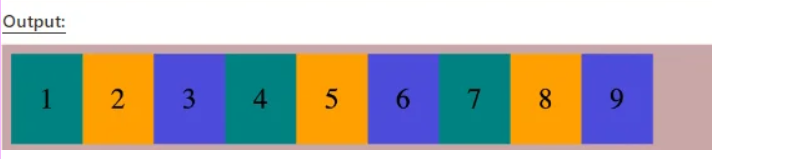
b). flex-wrap: wrap
When you set the flex-wrap property to wrap, you reduce the browser width that the items have wrapped in the container.Syntax:-
<style>
.box {
display: flex;
flex-wrap: wrap;
}
</style>
<div class="box">
<div>1</div>
<div>2</div>
<div>3</div>
<div>4</div>
<div>5</div>
<div>6</div>
<div>7</div>
<div>8</div>
<div>9</div>
</div> 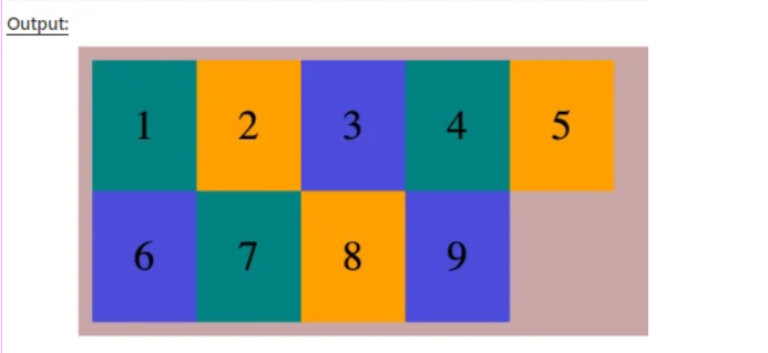
c). flex-wrap: wrap-reverse
Instead of items falling into the row below, they climb into the row above. Wrapping always occurs from the last item. wrap-reverse pushes the last item above instead of below.Syntax:-
<style>
.box {
display: flex;
flex-wrap: wrap-reverse;
}
</style>
<div class="box">
<div>1</div>
<div>2</div>
<div>3</div>
<div>4</div>
<div>5</div>
<div>6</div>
<div>7</div>
<div>8</div>
<div>9</div>
</div> 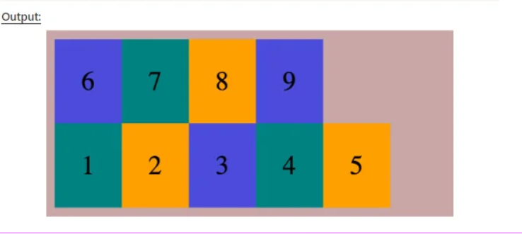
4. justified-content
justified-content defines the alignment of the items along the main axis. There are six possible values for the justified-content property:-
a). flex-start
b). flex-end
c). center
d). space-between
e). space-around
f). space-evenly
a). justified-content: flex-start
Setting the value to flex-start places the flex items at the beginning of the main axis, which is also known as the main start. flex-start is the default value in this property.Example:-
<style>
.box {
display:flex;
justify-content: flex-start;
}
</style>
<div class="box">
<div>1</div>
<div>2</div>
<div>3</div>
</div> 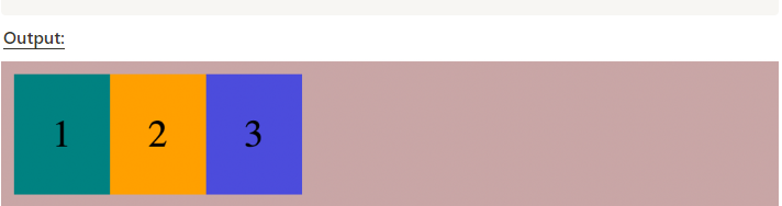
b). justified-content: flex-end
This aligns the items to be placed at the end of the main axis.Example:-
<style>
.box {
display:flex;
justify-content: flex-end;
}
</style>
<div class="box">
<div>1</div>
<div>2</div>
<div>3</div>
</div> 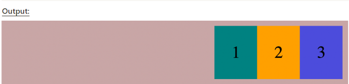
c). justified-content: center
The center value aligns all content at the center of the main axis.Example:-
<style>
.box {
display:flex;
justify-content: center;
}
</style>
<div class="box">
<div>1</div>
<div>2</div>
<div>3</div>
</div> 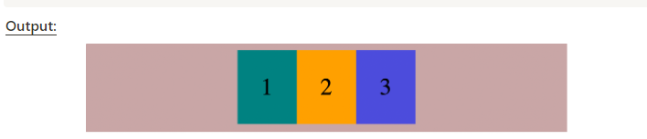
d). justified-content: space-between
This value helps to evenly split extra space and add it in between the flex items.Example:-
<style>
.box {
display:flex;
justify-content: space-between;
}
</style>
<div class="box">
<div>1</div>
<div>2</div>
<div>3</div>
</div> 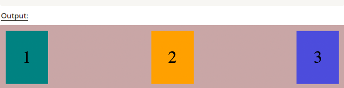
e). justified-content: space-around
This value splits the extra space at the beginning and the end. The space in question is equal to half of the space between the flex items.Example:-
<style>
.box {
display:flex;
justify-content: space-around;
}
</style>
<div class="box">
<div>1</div>
<div>2</div>
<div>3</div>
</div> 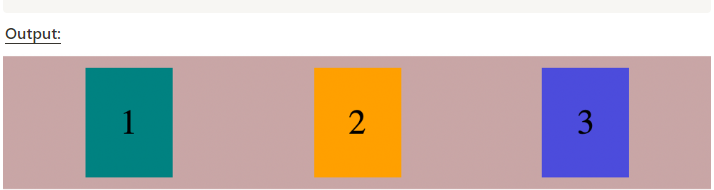
f). justified-content: space-evenly
It distributes the extra space in the container equally between the items inside the container, including both the beginning and the end.Example:-
<style>
.box {
display:flex;
justify-content: space-evenly;
}
</style>
<div class="box">
<div>1</div>
<div>2</div>
<div>3</div>
</div> 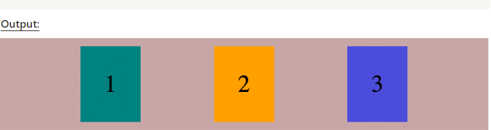
5. align-items
The align-items property defines how the flex items are laid out along the cross axis.
a). align-items: stretch
b). align-items: flex-start
c). align-items: flex-end
d). align-items: center
a). align-items:stretch
This is the starting point of the cross axis. The cross axis flows from top to bottom. The item doesn’t stretch and is aligned with the cross start of the line.Example:-
<style>
.box {
display:flex;
justify-content: space-evenly;
}
</style>
<div class="box">
<div>1</div>
<div>2</div>
<div>3</div>
</div> 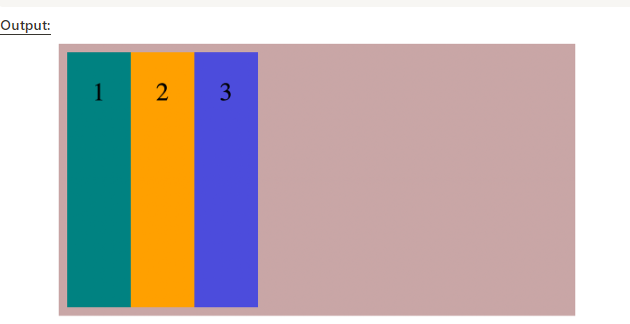
b). align-items:flex-start
This is the starting point of the cross axis. The cross axis flows from top to bottom. The item doesn’t stretch and is aligned with the cross start of the line.Example:-
<style>
.box {
height: 300px;
display:flex;
align-items: flex-start;
}
</style>
<div class="box">
<div>1</div>
<div>2</div>
<div>3</div>
</div> 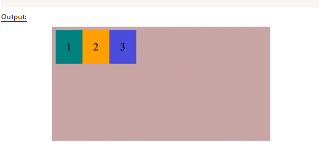
c). align-items:flex-end
This value pushes the items to the end of the cross axis.Example:-
<style>
.box {
height: 300px;
display:flex;
align-items: flex-end;
}
</style>
<div class="box">
<div>1</div>
<div>2</div>
<div>3</div>
</div> 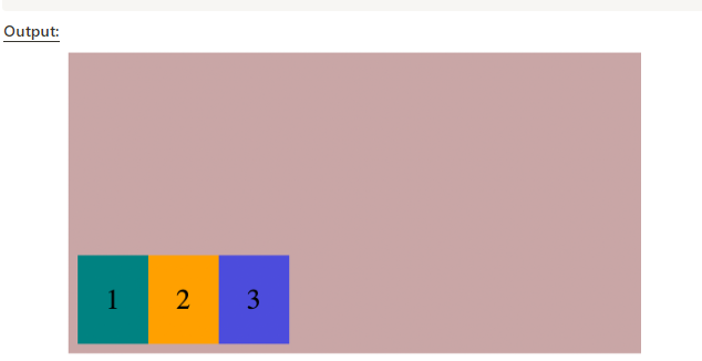
d). align-items:center
This centers the content along the cross axis.Example:-
<style>
.box {
height: 300px;
display: flex;
align-items: center;
}
</style>
<div class="box">
<div class="box-item">1</div>
<div class="box-item">2</div>
<div class="box-item">3</div>
<div class="box-item">4</div>
</div> 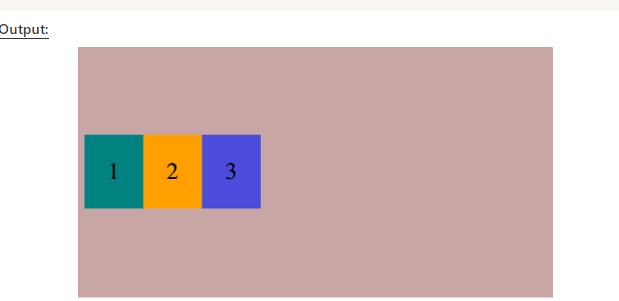
Conclusion:-
In conclusion, flexbox properties offer a powerful and flexible way to create layouts in CSS. By using properties like `display: flex`, `flex-direction`, `justify-content`, `align-items`, and `flex-wrap`, we can easily control the arrangement and alignment of elements within a flex container. Overall, flexbox simplifies the process of creating responsive and dynamic layouts, making it a valuable tool for modern web development.
Thanks for sharing. Very nice explanation with examples.
Thank you so much 💞
Thanks for the easy and comprehensive explanation! Very useful.
This is so much helpful thanks
Thank you ✨ and can you share more info related css properties