
- Interactive animation controls
- Multiple CSS animation effects
- Real-time animation preview
- Smooth transform and transition effects
- Clean and modern UI layout
- Responsive design for different screen sizes
- Easy experimentation with animation styles
- JavaScript-powered animation switching
CSS Animation Playground with HTML, CSS & JavaScript
40 DAYS 40 PROJECT CHALLENGE
Day #27
Project Overview
A CSS Animation Playground built using HTML, CSS, and JavaScript that allows users to experiment with different CSS animation effects interactively. Users can trigger animations such as bounce, rotate, scale, and slide to see how CSS animations work in real time. This project demonstrates important frontend concepts including CSS keyframes, transitions, transforms, and interactive UI controls, making it a great learning tool for beginners exploring animation in web design.
Key Features
HTML Code
<!DOCTYPE html>
<html>
<head>
<meta charset="UTF-8">
<title>CSS Animation Playground</title>
<link rel="stylesheet" href="style.css">
</head>

<body>

<div class="container">

<h1>CSS Animation Playground</h1>

<div class="playground">

<div id="box"></div>

</div>

<div class="controls">

<button onclick="animateBox('bounce')">Bounce</button>
<button onclick="animateBox('rotate')">Rotate</button>
<button onclick="animateBox('scale')">Scale</button>
<button onclick="animateBox('slide')">Slide</button>
<button onclick="animateBox('reset')">Reset</button>

</div>

</div>

<script src="script.js"></script>

</body>
</html>
CSS Code
*{
margin:0;
padding:0;
box-sizing:border-box;
font-family:Arial;
}

body{
background:#042354;
display:flex;
justify-content:center;
align-items:center;
height:100vh;
}

.container{
background:white;
padding:40px;
border-radius:12px;
width:500px;
text-align:center;
box-shadow:0 10px 30px rgba(0,0,0,0.1);
}

h1{
margin-bottom:25px;
}

.playground{
height:200px;
display:flex;
justify-content:center;
align-items:center;
margin-bottom:30px;
}

#box{
width:80px;
height:80px;
background:#2563eb;
border-radius:8px;
}

/* CONTROLS */

.controls{
display:flex;
flex-wrap:wrap;
gap:10px;
justify-content:center;
}

button{
padding:10px 15px;
border:none;
background:#2563eb;
color:white;
border-radius:6px;
cursor:pointer;
font-weight:bold;
}

button:hover{
background:#1d4ed8;
}

/* ANIMATIONS */

.bounce{
animation:bounce 0.8s infinite alternate;
}

@keyframes bounce{
from{transform:translateY(0)}
to{transform:translateY(-80px)}
}

.rotate{
animation:rotate 1s linear infinite;
}

@keyframes rotate{
from{transform:rotate(0deg)}
to{transform:rotate(360deg)}
}

.scale{
animation:scale 1s infinite alternate;
}

@keyframes scale{
from{transform:scale(1)}
to{transform:scale(1.5)}
}

.slide{
animation:slide 1s infinite alternate;
}

@keyframes slide{
from{transform:translateX(-100px)}
to{transform:translateX(100px)}
}
Javascript Code
const box = document.getElementById("box")

function animateBox(type){

box.className = ""

if(type !== "reset"){
box.classList.add(type)
}

}
Subscribe
0 Comments
Oldest
Newest
Most Voted
Inline Feedbacks
View all comments
Related Projects
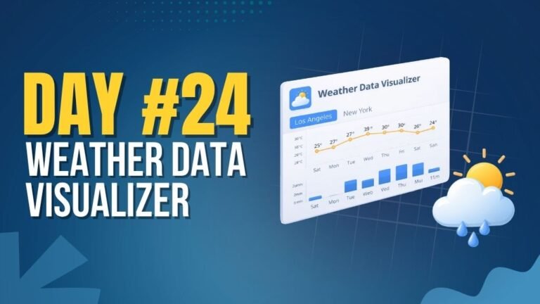
Day 24 : Weather Data Visualizer
Shows real-time weather data based on user location or input.
Concepts: API integration, async data handling, dynamic UI rendering.

Day 25 : Expense Analytics Dashboard
Tracks and visualizes expenses with charts and category breakdowns.
Concepts: Data visualization, state management, dynamic rendering.

Day 29 : Web Accessibility Analyzer
Analyzes website accessibility and highlights improvement areas.
Concepts: DOM analysis, accessibility checks, UI feedback.